
Why Your Bedroom Doesn’t Need to Be Calm
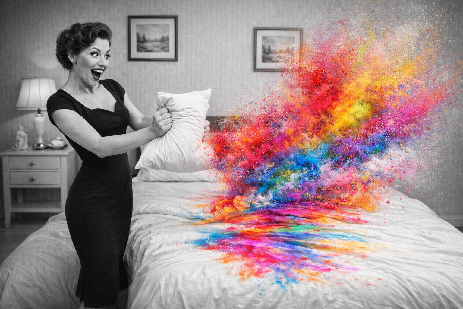
Calm is having a moment. Again.
From warm magnolias and buttery neutrals to the rise of quiet luxury and minimaluxe, we’re being gently encouraged to soften our spaces, mute our palettes, and dial everything down. Even Pantone has joined in, naming ‘Cloud Dancer’ – an elegant off-white neutral – its Colour of the Year for 2026.
It’s tasteful.
It’s soothing.
And for many of us, it’s starting to feel oddly familiar.
Britain’s Long Affair With Composure
In the UK, we’ve always had a complicated relationship with calm. It’s practically cultural muscle memory – a legacy of the stiff upper lip, politeness as virtue, and emotional restraint as good manners. Even our penchant for queueing has somehow managed to culturally define us.
Which is perhaps why KEEP CALM AND CARRY ON once crept into our homes with such enthusiasm. What began as a wartime message of resilience ended up plastered across cushions, mugs, posters, and tea towels – each new variation prompting a quiet, collective groan.
KEEP CALM AND HAVE A CUPPA.
KEEP CALM AND PUT THE KETTLE ON.
KEEP CALM AND… honestly, enough.
At some point, reassurance tipped into instruction. Calm stopped being comforting and started feeling compulsory.
When Neutral Becomes a Rule
Neutral palettes were never the enemy. They were meant to be a backdrop – a starting point. But somewhere along the way, neutrality became a benchmark of ‘good taste.’ Bedrooms began to look correct rather than lived in. Approved rather than expressive.
Calm, it turns out, can be surprisingly bossy.
For maximalists, this has sparked a rebellion – not against rest, but against obedience. A reminder that personality doesn’t always whisper. Sometimes it prowls. Sometimes it clashes. Sometimes it shows up wearing leopard print.
(Which, for the record, is a neutral. Ask a fashion editor.)
Another Way to Think About Neutral
At Promiscuous Bedding, we come from the school of thought that neutral doesn’t mean empty.
Used with intention, leopard print, stripes, checks, spots, and geometrics function exactly like neutrals do in fashion: they ground a look, create rhythm, and allow statement pieces to shine. Fashion has always understood this. Interiors are just catching up.
Pattern doesn’t disrupt rest – it frames it.
Texture doesn’t compete with comfort – it creates it.
A bedroom doesn’t need to whisper to be soothing. It needs to feel honest.
Calm Isn’t the Same as Comfort
There’s an assumption that calm rooms are inherently more restful. But rest doesn’t come from visual restraint – it comes from permission.
Permission to like what you like.
Permission to mix softness with edge.
Permission to choose Whimsical one night and Rebel the next.
Your bedroom doesn’t need to remind you to behave. It needs to hold you.
No Loyalty to Conformity
Our bedding sets aren’t designed to blend in. They’re designed to be the gown of the room – expressive, intentional, and unapologetically present. Whether your backdrop is magnolia, leopard, or something entirely your own is beside the point.
Calm is lovely.
So is character.
So is contradiction.
And if KEEP CALM AND CARRY ON taught us anything, it’s that sometimes the most radical thing you can do is stop carrying on altogether.